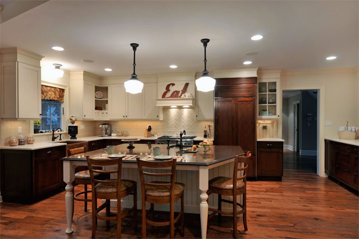
I thought I’d blog about the design elements in this recent kitchen and bath remodeling project we completed. Light and informal, the space is packed with significant details. The kitchen was once a handful of small chopped up spaces with varying ceiling heights. It could only be described as “just plain ordinary.” Now this Port Washington residence boasts unified spaces and a cohesive color scheme in its new kitchen, desk area, and two bathrooms.
The client wanted to create an inviting, cozy cottage style space inspired by the neighborhood bakeries of yesteryear mixing in their art collection of delicious confectionaries. The simple lines of the Wood-Mode cabinetry, a soothing color scheme of Vintage White and Candlelight, create zones for different family functions.

This play of color is further enhanced by Quartz countertop materials chosen for both their beauty and durability. Simple textures and classic design lines appear in the subway and herringbone tile designs on the backsplash and the reproduction “old school-house” pendants above the island.
The red copper farm sink, like an old friend, holds its own as the center-point of the modern clean-up zone replete with a hidden trash and energy-efficient dishwasher disguised with wood panels. Other modern appliances such as a warming drawer to the left of the Wolf range and Sub-Zero food preservation are cloaked in wood panels to further the warm and inviting feeling. By keeping twenty-first century appliances paneled, the touches of antique mullion glass doors, bead board, peg rack, corbels, and leg details truly make a statement.

The center island, complete with a second sink, microwave, and other modern storage conveniences, is designed to resemble a farmhouse table with bead board detailing. It is the perfect spot for chopping vegetables and completing homework assignments.
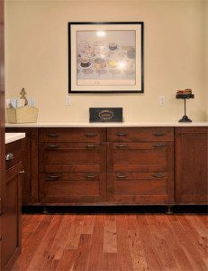
Hand-hewed hickory flooring throughout ties all the public spaces together creating visual continuity. Open to the dining room is a buffet server, which effortlessly holds the largest serving platters and make entertaining a breeze.
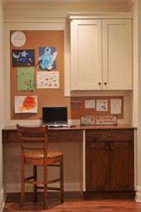
Tying this kitchen into one neat and masterful package is the desk area, which serves as the nerve center of the home. Looking neat as a pin, it is the “go-to” spot for messages, party invitations, car pool schedules, and home electronic storage.
The guest bathroom’s clever use of angles in both the vanity wall and neo-angle shower stall opens up the space for better flow.
Porcelain tile with the look of antique stone is a snap to keep clean. Vanity cabinetry in Brookhaven’s Pelham Manor style has a hand applied espresso glaze, and a marble top with an arched backsplash was designed to look like a vintage washstand. Bead board paneling, glazed to match the vanity, surrounds the room with its inviting texture.
Opting for a more restful feeling, the client’s master bath is more of a Zen-like haven of inviting textures and creature comforts. More contemporary uses of porcelain, glass pebbles, cherry wood, and metal make this feel like an oasis.
Raised and recessed areas of the vanity keep all things close at hand without compromising valuable counter space. Corian countertops on the vanity and under-mount sinks lend simplicity to the master bath design.
See a video tour and detailed photos of this beautiful kitchen.


